Showing posts with label EMP 008: Dying/Fabric Manipulation/Decoration. Show all posts

Tuesday, May 15, 2012

Finsihing the Sleeves

The sleeves were two of the things I had completed and decorated first. But I also knew that there would need to be more decoration put over top of them, based on the design. When I was fabric shopping I had found a very elaborate piece of lace that came in both pink and black. When I bought it, it was for the soul purpose of using on the sleeves. It was one of the most expensive cuts I bought so I didn't use it anywhere else so that I knew I would have enough. On the black bodice it worked so well, although as lace it had some irregularities that was a little difficult to work around but it turned out really well.
Without Sleeve Decoration

With Additional Sleeve Decoration
However when I went to apply the pink lace I wasn't entirely pleased with how it looked. Unfortunately it was a slightly different shade of pink to the laser cut decoration on the front and it stood out. It didn't look awful but I tried to see if there was another better looking option before I applied the lace. I decided my best course of action might be to use the same pink velvet for the sleeve. But I didn't know what to mount it on. When looking at my bodice I felt like maybe something a little lighter would tie it in with the skirt more, so I used a silk organza, one I had used a lot of in the skirt. Here is the comparison:

To me it is clear that the sleeve on the left is more successful. It has more movement and relates perfectly to the pink in the bodice. I also think the lightness of the organza also ties everything together neatly. Although it is slightly different to how I originally pictured it I think it is a great design decision.

Bodice with Finished Sleeves

Sunday, May 13, 2012

Finsih the Bodice Decoration

After the bodice was piped and neatly finished at it's hem I started to put the final decoration on the front. This, for both, was putting on some laser cutting. For Princess Colour it was pink velvet and for Princess Silhouette it was black velvet. I went around and did small tacks around each laser cut piece just to make sure it was secure. The neck-line decoration was different for each.

Princess Colour:


I think this pink velvet is really appropriate for the design. It really pops against the grey and adds a little texture too. I used a sheer fabric to create the ruffle at the neck, I used my pinking shears again on the edges to make them neat. I think this works because it really rounds the neck out more to the design. I also added a small strand of little cream pearls to tie in a little more lightness because that ruffle by itself looked a little too dark. And then the black trim. I was really unsure about this how I was going to make this look like the design. However I was really lucky to find this piece of lace. To make it better stand on it's own it is backed in a silk organza and tacked around. I also put a little piece of transfer adhesive at it's base to make it stronger. I also wanted to make a not of how I applied this trim because it was a new process for me and not how I was expecting to do it. I thought perhaps I would just hand sew it on to the facing. However instead, after talking to my tutor, I used a piece of bias binding to finish off the edge, which was cut and slightly rounded. Then I slip-stitched that to the facing and then did small tacks to hold it to the facing closer to the finished edge. I feel pleased with how the bodice came together. I had to make a lot of design decisions but I think by looking at the design constantly I was able to stay true to it.

Princess Silhouette:


Finishing Princess Silhouette's bodice was a somewhat similar process. The black velvet laser cutting looks great on the bodice. Again it adds another dimension and some texture but stays completely true to the all black that is in the design. I also put more of it on than I did on the colour. I thought it would be more dramatic and more character appropriate. For the neck decoration I went down a slightly different path. Instead of using multiply decorations I used just one wide piece of lace. I liked this lace because it was bit thicker than normal lace and had a slight sheen to it in some places. I also thought this would be good because the her neck-line in the fitting was a little low and this could compensate for that. In the centre of the lace I added a really thin piece of lace that I threaded ribbon through to tie in a bow at the centre front. I had intentions to possibly add more decoration at the neck but I felt like that would be over-kill. Between the velvet and the lace there was enough going on. I think this is a huge successful from both a making and designing perspective. It is well made which is always good. And it is a successful interpretation to the design which is drawn in solid black. I am pleased that I could keep it that kind of solid colour but still make it distinct while relating it to the other more colourful bodice.


Friday, May 11, 2012

Creating Princess Silhouette's Bodice

Creating Princess Silhouette's bodice was relatively straight forward after creating Princess Colour's. I used the same technique of 2inch strips cut with pinking sheers and placed at a diagonal. However for this one I have them going the opposite way so they created a true V, meeting at the bottom rather than at the neck-line. Also because the base fabric is so shiny I haven't left any of it exposed but placed a light black netting in the opening to tone down the shine. Unfortunately I only have a photograph of the back.

Although this isn't a great photograph I think it shows the general idea. I used three different types of black fabric and incorporated one piece of wide lace on either side of the centre back. I'm very pleased with how this bodice turned out an am excited to see how it looks with the rest of the decoration.

Wednesday, May 9, 2012

Princess Silhouette Skirt Development

After making the skirt for Princess Colour I thought making the skirt for Princess Silhouette would be a bit more straight forward. In some ways it was. I knew my panel patterns worked well and kind of the process of creating the sheer panels and the solid ones. But this process was a bit different because it was about creating depth and texture and not at all about mixing together colour.
Gibb, S. and Jones, U. (2009). The Princess Who Had No Kingdom. London: Orchard Books.
Original design
To start creating this skirt I started with the solid bottom panels and then I created the laser cut ones. This way I could put together the bottom two layers on together rather than just one at a time. I really enjoyed experimenting with black on black fabrics, putting in as much contrast and texture as I could.
I think these bottom two layers really came together well. I felt like it was a bit of a risk using the grey sheer fabric but it does add a new dimensionality to the skirt. And since more black layers will be going over top it shouldn't be too noticeable. I then had to start creating the middle layers. I quickly realized that I did a much better job fabric shopping for this costume than for the other. I had more textural fabric with pieces like a black flocked fabric and a subtle hounds-tooth print. And because of this I could create tabs of just the fabric without any decoration and therefore made more tabs more quickly. This was particularly helpful in adding depth and texture; the more tabs the better!


The skirt above came together a lot faster than the colour one and I feel like it is just as successful. One of the challenges in creating the this skirt has been to incorporate the lighter colours that you can see in the design (where the patterns are really shown off). At first I thought that maybe I could use some of the lighter fabric from the other dress but I wasn't sure how to use it in a subtle way. I discovered that I could use the big sheet of fabric that all the laser cut shapes came from mounted on silk organza to create lighter pattern. This worked well because there was more black than cream but still defined shapes and because the organza is sheer it isn't a startling light colour. Having mostly completed the skirt it is interesting to see that it is a slightly different shape than the colour skirt. This must have to do with the fact that has a different understructure. But since the rings are the same size I didn't think it would make as much of a difference. However the open cage which I think is a bit shorter than the hoop, has more of dramatic rounded shape, where as the colour is just a bit more gradual.

Saturday, May 5, 2012

Decorating Princess Colour's Bodice

When it came time to decorate the bodice I can admit I was lost. I really felt like this is where I want a designer to help me decide what to do. The illustration is both clear and un-clear on how the bodice should look. It is very clear that it has pink decoration on the front and a rounded neckline with some kind of black decoration. It also vaguely shows that it is layered with multiple colours evoking more of the grey and brownish tones of the skirt.
Gibb, S. and Jones, U. (2009). The Princess Who Had No Kingdom. London: Orchard Books.
I thought that mixing the fabrics for the bodice would help the layered look come together, but once I started draping I can see that it might make it more difficult. This was my first attempt at just doing some basic draping:
 It is clear that the rouched fabric doesn't really work. It is too dense and not light enough. I also don't think it evokes enough colour and texture. In talks with my tutor she also agreed it wasn't really working and suggested that I focus on the skirt a little more and then let that inform my bodice decoration.

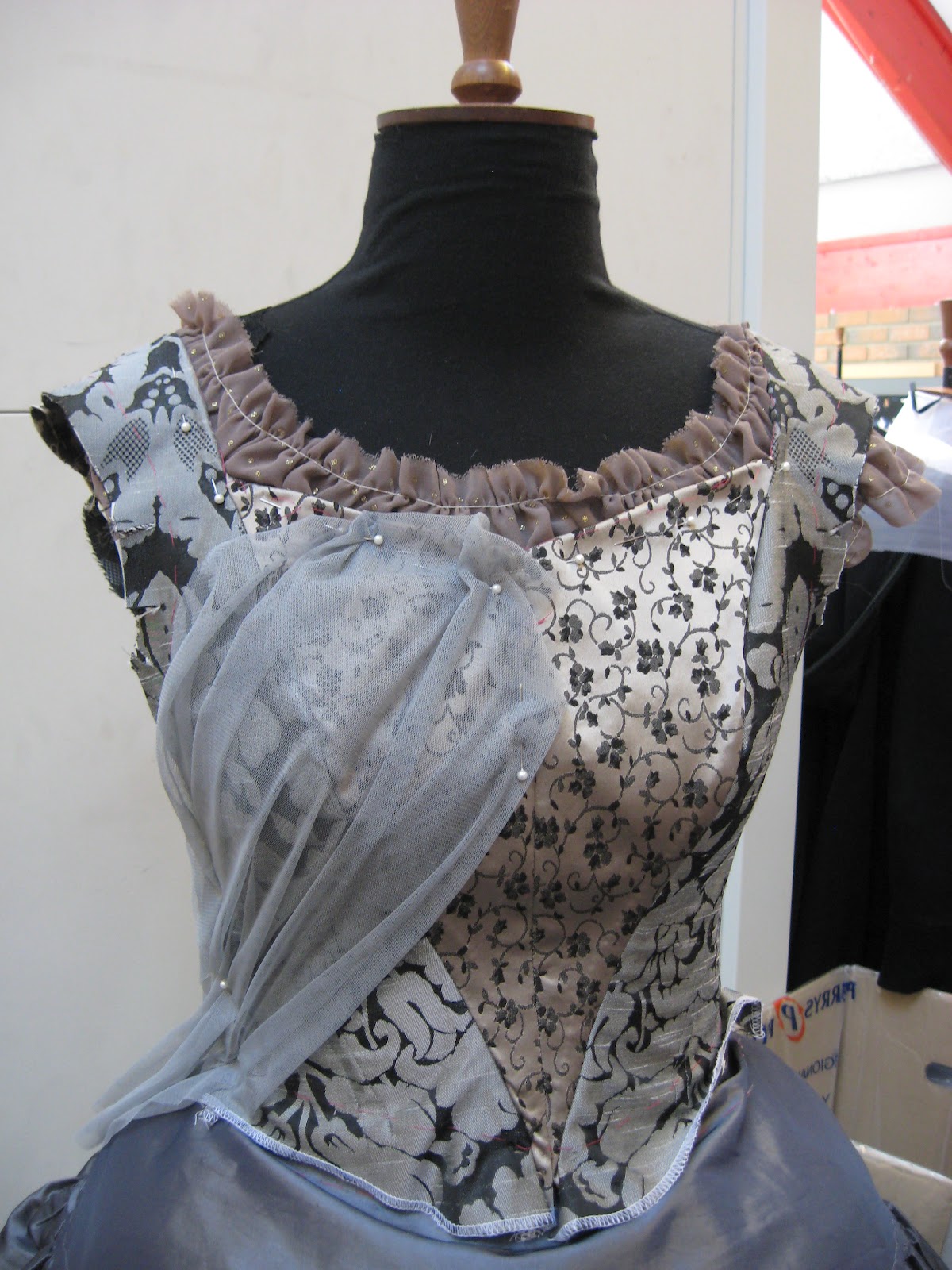
After I've been working and developing the skirt I was ready to give it another go. I thought that it would be clever to use scraps from all the fabrics on the skirt and piece together a bodice covering from those scraps. I thought that this would really bring everything together. I did stitch together a little sample but it looked awful, it was clear that not all the fabrics looked right over the fabrics of the bodice and that they didn't go well enough together. And the machine stitching was too heavy and visible. I scrapped that idea without a second thought. Instead I began to piece on scraps with the bodice on the stand, being a little more careful about what fabrics I used and where the went. I thought that maybe I could just hand-sew them on which would eliminate the heavy machine stitching. I was undecided about this technique and decided I needed to try something else to compare it to. I've realised throughout this project that I like uniform things, I like having a pattern to follow or at least a system. So instead of piecing things on randomly I decided to play to my strengths and creating a pattern type system. I chose three fabrics that I really felt looked good over the bodice base and cut them into 2 inch strips using my pinking shears and then layered them on in a diagonal across the bodice. Here are the two techniques side by side:


I think it is extremely clear which one is better. The strips on the right are more uniform and more purposeful. They show off the under fabric a lot better than just the random pieces. I shouldn't have worried about using every single fabric that was on the skirt; there is going to be plenty of other decoration on the bodice that will certainly help tie everything together. By having just the three essential fabrics it tones it down without looking too busy. I also think this will be easier to attach. I can do straight lines of prick-stitches instead of having to go around different size pieces.

Friday, May 4, 2012

Princess Colour Skirt Development


 Developing the skirt for Princess Colour has been both exciting and stressful. I was really unsure how to even start this process but I thought I should make patterns for the tabs rather than just experimentally cut all the pieces. I think this fits the design more because it does have a certain uniformity. I knew that from making the calico pieces that it can also waste fabric by just experimenting. By just having a couple of different tab patterns in different length I can focus more on the decoration and texture rather than the size. What I've found a bit difficult about creating the skirt is knowing what colours to use and how many is too many or too few. I want it to look effortless like the design. What I started with was what I knew I needed and had a clearer vision of from the design: the laser cut patterns. I've really enjoyed seeing my laser cutting come to life appliquéd onto the tabs. It is an easy and rewarding process and I think the result is perfect for my design.


Gibb, S. and Jones, U. (2009). The Princess Who Had No Kingdom. London: Orchard Books.
The Original Design
My first attempt

 I am really really pleased with how the skirt looks with the laser cutting. When I was applying all the different shapes I really tried to look at my illustration for reference so that I could try to emulate her patterns with my different shapes. However this was just all of those panels and I will need to fill in with other panels. The question I wasn't really sure how to answer was: should they be solid fabric or sheer, should they be decorated or plain, how many, what length.  When looking at all my fabrics on the table I realized that I had bought some that no longer really worked colour wise, so I eliminated using those and instead focused on the ones that looked most like the design. My tutor also suggested using the fabrics from the bodice. I was sceptical at first about this but after making a few they really fit in well.


  These are the two bottom layers after some new tabs and a bit of reconfiguration. I think they look a lot more like the illustration. It still retains it's lightness which is really important to me but the solid layers underneath add so much more depth  as well. I've some more middle and top layers to create but with this start I really feel I can move forward more successfully. Creating even just this much of skirt has really tested my ability to make design decisions. I've learned just to be bold and use a lot of pins!