Saturday, May 12, 2012

Budget


Fabric Price List:

Where/When
When
Content/Description
Amount
Price
Laura Ashley
25/01/12
Tatton Champagne Printed Fabric
2.9 m.
26.1
John Lewis
25/01/12
White Cotton Voile
5 m.
25
Fabric Land
03/03/12
Pink Organdie
2 m.
3.98
Fabric Land
03/03/12
Grapefruit Organdie
2m.
3.98
Fabric Land
03/03/12
Silver Organdie
4m.
10
Fabric Land
03/03/12
Black Organdie
2m.
3.98
Fabric Land
03/03/12
Grey Spotted Netting
1m.
2.99
John Lewis
03/03/12
White Net with Black Polka Dots
1m 10cm
3.08
Fabric House Ltd
24/02/12
Black and White Spotty Silk
2m
13
Fabric House Ltd
24/02/12
Black Netting
3m
7.5
Fabric House Ltd
24/02/12
Black Hounds-tooth
2m
11
A to Z Fabrics
24/02/12
Silvery Grey Silk
4m
6
A to Z Fabrics
24/02/12
Black and Silver Sequinned Fabric
.5m
7.5
Classic Textiles
24/02/12
Light Brown w/Gold Dots (sheer)
1m
3.5
Unique Fabrics
24/02/12
Polyester Silk Beige
3m
7.5
Unique Fabrics
24/02/12
Polyester Silk Black
2m
5
Unique Fabrics
24/02/12
Polyester Silk Grapefruit
2m
5
Unique Fabrics
24/02/12
100% Silk- Brown to Cream
1m
6.5
Fancy Fabrics
24/02/12
Black Flocked Velvet
1m
10
Fabric World
24/02/12
100% Silk Light Pink
1m
10
Fabric World
24/02/12
Dove Grey
1m
5.5
Classic Textiles
24/02/12
Grey Netting
2m
6
Classic Textiles
24/02/12
Cream Netting
2m
6
Classic Textiles
24/02/12
Dusty Pink Net and Embroidery
.5m
9
Classic Textiles
24/02/12
Black Net and Embroidery
.5m
9
UK Textiles
24/02/12
Dark Grey and Silver Print
1m
10
UK Textiles
24/02/12
Black and Tan Print
.5m
6
---------------------
-----------
-------------------------------------------
---------
223.11
AUCB
27/01/12
Black Cotton Drill
4.5m
18
AUCB
06/02/12
Silk Organza
3m
18.6
AUCB
07/03/12
Silk Organza
2m
12.4
AUCB
07/03/12
Light-weight Calico
3m
7.5
AUCB
07/03/12
Cotton Organdie
1m
3.5
AUCB
11/04/12
Devore Velvet
1.5m
18
AUCB
11/04/12
Cotton Organdie
4m
14
AUCB
11/04/12
Light-weight Calico
2m
5
---------------------
-----------
-------------------------------------------
---------
97
Fabric Land
25/04/12
Black Satin
5m
19.95
Fabric Land
25/04/12
Black Velvet
1.5m
10.5
Fabric Land
25/04/12
Transfer Adhesive
2.5m
7.47
AUCB
27/04/12
Transfer Adhesive
5m
12.25
---------------------
-----------
-------------------------------------------
---------
49.72
Grand Total: 369.83


Haberdashery Price List:

Where
When
Content/Description
Amount
Price
John Lewis
03/03/12
Black Crochet Wool
1 Spool
2.5
Barnett Lawson
24/02/12
Silver Bells
5
1
Barnett Lawson
24/02/12
Silver Bells
5
1.1
Barnett Lawson
24/02/12
Black Satin Ribbon
25m (spool)
5.5
Barnett Lawson
24/02/12
4mm Pearl Insertion
10m
5.5
New Trimmings Ltd
20/01/12
Cream Crochet Lace
2m
14
New Trimmings Ltd
20/01/12
Cream Net and Crochet Lace
2m
14
Wilkinson
03/02/12
Grey, Pink, Brown Dye
3 packets
8.97
-------------------------
---------------
--------------------------------
---------------
52.57
Vena Cava
29/02/12
Flexible Steel Busk
1
9.82
Vena Cava
29/02/12
Bones
26
11.9
Vena Cava
29/02/12
Bias Binding
5m
2.5
Vena Cava
29/02/12
Spiral Wire Caps
50
1.55
Vena Cava
29/02/12
Spiral Wire
12.5 m
10.5
Vena Cava
29/02/12
Plastic Boning
6 m
6.72
Vena Cava
29/02/12
Victorian Trim
1.5m
2.34
Vena Cava
29/02/12
Steel Hooping
6m
5.1
Vena Cava
29/02/12
Steel Hooping joints
6
2.1
AUCB
16/03/12
Bones
13
9.1
-------------------------
---------------
--------------------------------
---------------
61.63
Ebay (A D Peng)
13/02/12
Black Trim
18 yards
3
Ebay (A D Peng)
13/02/12
Black Trim
15 yards
3.1
Ebay (YU FAAT)
14/02/12
Black Lace
10 yards
2.2
Ebay (Gibson)
26/02/12
Cream Lace
15m
1.99
Gypsy Lace
11/03/12
Black Lace
2m
1.1
Gypsy Lace
11/03/12
Black Lace
1m
0.95
Gypsy Lace
11/03/12
Black Trimming
2m
3
-------------------------
---------------
--------------------------------
--------------
15.34

Grand Total: £129.54


Evaluation:
Dealing with a budget is something I haven't done for quite a few projects. I've mostly worked on projects that had supervisors that did all the budgeting so in some ways this felt like a new process. I think there are some things I did very well concerning the budget and some things I could have done better. I'm pleased to say that I stayed within my budget which was a huge success. My goal for the whole project was £500 and I spent a close total of £499.37! When broken down further I had a goal of £300 for the dresses and £200 for the undergarments. The undergarments went a little over that budget but I made up for it in the dresses. I also think I did a good job sourcing my materials. I used more on-line resources than I had ever before and found a few places I will remember for the future. And even though not everything I ordered online was how I thought it would be I adapted it to fit or if I had left-over I would try and use it some-place else. Not only did this help my project I think it helped me stretch my budget to get even more out of it. My biggest problem was that I over-bought; especially in London. I was really happy I went and I think it was worth the trip but I wish I would have waited until I got closer to actually making the dresses. If I had developed my ideas and made a really solid list of what I needed I could have been a little more frugal and careful in my purchases. Having said that I don't think I spent an exorbitant amount in London but I know there are some fabrics I bought there I didn't use. Creating and sticking to my own budget was a huge aspect of this project and I think it was success despite some ups and downs! 

Finshing The Bodice Inside

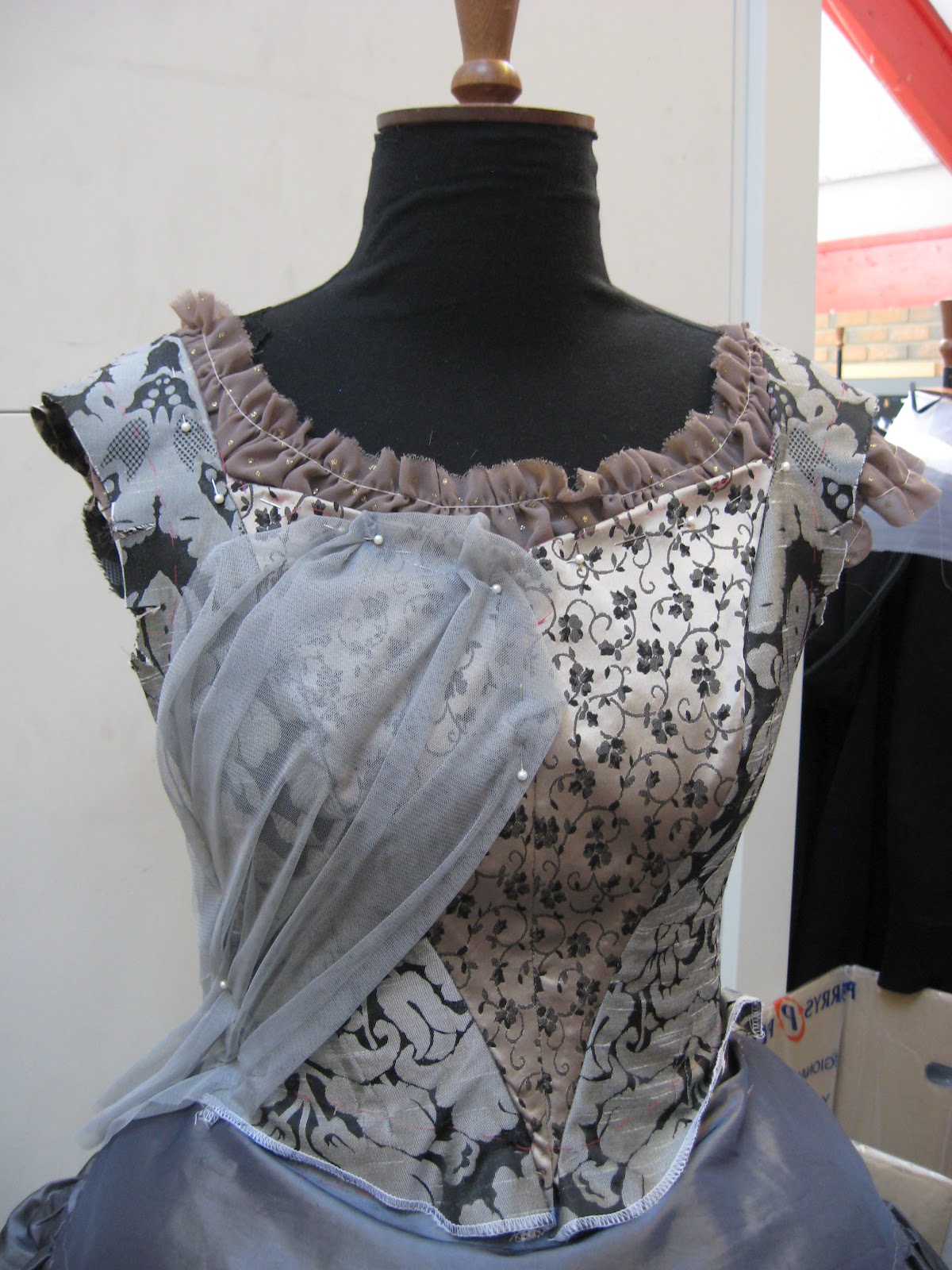
There have been some changes and developments on how to finish the inside of the bodices. I had originally thought to line them after all the decoration was applied. I thought this would cover any stitching and make it look clean inside. I could also have made it long enough to fold up and slip-stitched over the seam allowance of the skirt and bodice where they attach. But when I mentioned this to my tutor at my fittings she said it wasn't usually how costumes were finished, that lining is something done more in fashion. This is because a working costume needs to be easily adaptable for a show, so having a cumbersome lining only makes it more difficult. This made sense but I also wanted to use the seam allowance as casing for the bones and I didn't want to put too many stitch lines through the front. So to make it look neat and tidy I folded over all the seam allowance and slip-stitched it down. This way there were slots for the bones where needed but they all looked uniform and neat. And if every they needed to altered or let out, they could be easily opened and adjusted. To finish the neck-line (before the decoration was applied) I added a small facing. I originally had made it a little wider but it conflicted more with width of the shoulder so I had to trim it down. I feel like this has made the inside of the costume very neat without too much hassle or bulky extra fabric. I will probably finish the hem with piping and a facing as well. I also think that the stitching lines that are holding down the surface decoration look neat and tidy as well.


Friday, May 11, 2012

Creating Princess Silhouette's Bodice

Creating Princess Silhouette's bodice was relatively straight forward after creating Princess Colour's. I used the same technique of 2inch strips cut with pinking sheers and placed at a diagonal. However for this one I have them going the opposite way so they created a true V, meeting at the bottom rather than at the neck-line. Also because the base fabric is so shiny I haven't left any of it exposed but placed a light black netting in the opening to tone down the shine. Unfortunately I only have a photograph of the back.

Although this isn't a great photograph I think it shows the general idea. I used three different types of black fabric and incorporated one piece of wide lace on either side of the centre back. I'm very pleased with how this bodice turned out an am excited to see how it looks with the rest of the decoration.

Wednesday, May 9, 2012

Princess Silhouette Skirt Development

After making the skirt for Princess Colour I thought making the skirt for Princess Silhouette would be a bit more straight forward. In some ways it was. I knew my panel patterns worked well and kind of the process of creating the sheer panels and the solid ones. But this process was a bit different because it was about creating depth and texture and not at all about mixing together colour.
Gibb, S. and Jones, U. (2009). The Princess Who Had No Kingdom. London: Orchard Books.
Original design
To start creating this skirt I started with the solid bottom panels and then I created the laser cut ones. This way I could put together the bottom two layers on together rather than just one at a time. I really enjoyed experimenting with black on black fabrics, putting in as much contrast and texture as I could.
I think these bottom two layers really came together well. I felt like it was a bit of a risk using the grey sheer fabric but it does add a new dimensionality to the skirt. And since more black layers will be going over top it shouldn't be too noticeable. I then had to start creating the middle layers. I quickly realized that I did a much better job fabric shopping for this costume than for the other. I had more textural fabric with pieces like a black flocked fabric and a subtle hounds-tooth print. And because of this I could create tabs of just the fabric without any decoration and therefore made more tabs more quickly. This was particularly helpful in adding depth and texture; the more tabs the better!


The skirt above came together a lot faster than the colour one and I feel like it is just as successful. One of the challenges in creating the this skirt has been to incorporate the lighter colours that you can see in the design (where the patterns are really shown off). At first I thought that maybe I could use some of the lighter fabric from the other dress but I wasn't sure how to use it in a subtle way. I discovered that I could use the big sheet of fabric that all the laser cut shapes came from mounted on silk organza to create lighter pattern. This worked well because there was more black than cream but still defined shapes and because the organza is sheer it isn't a startling light colour. Having mostly completed the skirt it is interesting to see that it is a slightly different shape than the colour skirt. This must have to do with the fact that has a different understructure. But since the rings are the same size I didn't think it would make as much of a difference. However the open cage which I think is a bit shorter than the hoop, has more of dramatic rounded shape, where as the colour is just a bit more gradual.

Saturday, May 5, 2012

Decorating Princess Colour's Bodice

When it came time to decorate the bodice I can admit I was lost. I really felt like this is where I want a designer to help me decide what to do. The illustration is both clear and un-clear on how the bodice should look. It is very clear that it has pink decoration on the front and a rounded neckline with some kind of black decoration. It also vaguely shows that it is layered with multiple colours evoking more of the grey and brownish tones of the skirt.
Gibb, S. and Jones, U. (2009). The Princess Who Had No Kingdom. London: Orchard Books.
I thought that mixing the fabrics for the bodice would help the layered look come together, but once I started draping I can see that it might make it more difficult. This was my first attempt at just doing some basic draping:
 It is clear that the rouched fabric doesn't really work. It is too dense and not light enough. I also don't think it evokes enough colour and texture. In talks with my tutor she also agreed it wasn't really working and suggested that I focus on the skirt a little more and then let that inform my bodice decoration.

After I've been working and developing the skirt I was ready to give it another go. I thought that it would be clever to use scraps from all the fabrics on the skirt and piece together a bodice covering from those scraps. I thought that this would really bring everything together. I did stitch together a little sample but it looked awful, it was clear that not all the fabrics looked right over the fabrics of the bodice and that they didn't go well enough together. And the machine stitching was too heavy and visible. I scrapped that idea without a second thought. Instead I began to piece on scraps with the bodice on the stand, being a little more careful about what fabrics I used and where the went. I thought that maybe I could just hand-sew them on which would eliminate the heavy machine stitching. I was undecided about this technique and decided I needed to try something else to compare it to. I've realised throughout this project that I like uniform things, I like having a pattern to follow or at least a system. So instead of piecing things on randomly I decided to play to my strengths and creating a pattern type system. I chose three fabrics that I really felt looked good over the bodice base and cut them into 2 inch strips using my pinking shears and then layered them on in a diagonal across the bodice. Here are the two techniques side by side:


I think it is extremely clear which one is better. The strips on the right are more uniform and more purposeful. They show off the under fabric a lot better than just the random pieces. I shouldn't have worried about using every single fabric that was on the skirt; there is going to be plenty of other decoration on the bodice that will certainly help tie everything together. By having just the three essential fabrics it tones it down without looking too busy. I also think this will be easier to attach. I can do straight lines of prick-stitches instead of having to go around different size pieces.

Friday, May 4, 2012

Princess Colour Skirt Development


 Developing the skirt for Princess Colour has been both exciting and stressful. I was really unsure how to even start this process but I thought I should make patterns for the tabs rather than just experimentally cut all the pieces. I think this fits the design more because it does have a certain uniformity. I knew that from making the calico pieces that it can also waste fabric by just experimenting. By just having a couple of different tab patterns in different length I can focus more on the decoration and texture rather than the size. What I've found a bit difficult about creating the skirt is knowing what colours to use and how many is too many or too few. I want it to look effortless like the design. What I started with was what I knew I needed and had a clearer vision of from the design: the laser cut patterns. I've really enjoyed seeing my laser cutting come to life appliquéd onto the tabs. It is an easy and rewarding process and I think the result is perfect for my design.


Gibb, S. and Jones, U. (2009). The Princess Who Had No Kingdom. London: Orchard Books.
The Original Design
My first attempt

 I am really really pleased with how the skirt looks with the laser cutting. When I was applying all the different shapes I really tried to look at my illustration for reference so that I could try to emulate her patterns with my different shapes. However this was just all of those panels and I will need to fill in with other panels. The question I wasn't really sure how to answer was: should they be solid fabric or sheer, should they be decorated or plain, how many, what length.  When looking at all my fabrics on the table I realized that I had bought some that no longer really worked colour wise, so I eliminated using those and instead focused on the ones that looked most like the design. My tutor also suggested using the fabrics from the bodice. I was sceptical at first about this but after making a few they really fit in well.


  These are the two bottom layers after some new tabs and a bit of reconfiguration. I think they look a lot more like the illustration. It still retains it's lightness which is really important to me but the solid layers underneath add so much more depth  as well. I've some more middle and top layers to create but with this start I really feel I can move forward more successfully. Creating even just this much of skirt has really tested my ability to make design decisions. I've learned just to be bold and use a lot of pins!

Saturday, April 28, 2012

Decorating the Underskirts

Throughout this project I've tried to really pay attention to the small details. Because there are a lot pieces and a lot of movement in the skirt I didn't want to ignore the base skirts. In the book the Princess does go to a ball and dance, and in a performance with all that movement I wouldn't want the underskirt to be plain if it might be seen. So I've decided to just do some small decoration around the base kind of relating to both eras the bodice's are taken from. It is also helpful to decorate and finish the skirts now so that when all the layers are on I won't have to struggle to do the hem or decorate it.

Princess Colour:
Lambert, M. (1991) Fashion in Photography 1860-1880. London: B.T. Batsford.
 I really love this photograph from 1870. I think it has a great subtlety of style and I especially like the different layers of decoration on the skirt.


I tried to evoke the style of layered decoration from the old photograph in my underskirt. I didn't want the decoration to be over-whelming and over-all very whimsical and sweet. The lace is actually the negative of the lace that I used to decorate the hoop skirt that is under it. The black lace is threaded through with some pink wool. Aside from adding visual interest I also like this because it is, in it's essence) all the colours that the over-dress will have on it: pink, cream, and black. I'm very happy with this decoration.


Princess Silhouette:
Kyoto Costume Institute. (2002) Fashion: A History from the 18th Century to 20th
                             Century. Hong Kong: Taschen.
This 18th century dress (with a close up on the right) contains some of my favourite decoration from this era. It is very romantic and very rococo! From this I took the kind of wavey type trim that is a bit more narrow.

Although this isn't a very colourful trim like on Princess Colour I feel it really adds a lot to the underskirt. The matte tone of the cotton against the shiny fabric adds a bit more depth and tones down the brightness a lot. Creating this trim was very easy with just some pinking shears, fray check, and lots of strips; but it really does add another element to the skirt. I like that it makes it look more decadent and stylish, which Princess Silhouette is. I also added a very thin line of simple black lace to cover up the machine stitching on the hem.